How can you use time to your advantage in interaction design ? Is it even controllable?
The elements of timing can be difficult to describe, but we all feel them, from the annoyance of waiting for something to load, to the exhilaration of breezing through page after page. The scale of timing is wide, ranging from noticeable increments to the tiny milliseconds that individually seem meaningless, but can add up to sway a user’s opinion one way or the other.
Our discussion in this piece applies all content that changes over time: video, sound, animations, and more. We’ll start by explaining why time matters, then discuss the elements of timing and how they can be improved, and then we’ll explore how speed and simplicity play a role.
Why Time Matters
Time can be a difficult concept to grasp because its range is so vast. Just as the size of an electron is almost unfathomable compared to the enormity of our galaxy, so too the span of a millisecond seems unrecognizable to the duration of a millenium.
But digital time is not the same as human time. A few seconds can mean the difference between a frustrating experience and a delightful one. We can attribute that to basic human psychology:
- Limits of memory and attention — Designers must evaluate the cognitive load of interfaces. Otherwise, users will suffer from the loss of information in short-term memory, which causes frustration.
- People must feel in control — Nobody wants to be at the mercy of technology. Some people still treat computers as a black box. Digital products that make you wait will give off the impression of incompetence and/or arrogance.
There is a rhythm to user actions. In the field of UX, the power of time is measured in magnitude 10. It takes users 0.05 seconds to decide if a website is worth their time. If they decide to stay, they usually leave within 2-4 minutes.
Whether the goal is getting an update on your Facebook feed or comparing and buying products on Amazon, every experience breaks down into a series of interactions, and the time between interactions has a compounding effect on the user experience.
Elements of Time in Interaction Design
So how exactly does time relate to interaction design? David Malouf, Design Consultant, believes that time separates interaction design from all other UX disciplines. Time is more than just a linear progression because all interactions happen over time. We can actually examine time from 3 separate perspectives: pace, responsiveness, and context.
1. Pace
In terms of design, pacing relates to how much is accomplished in a given amount of time. Immediately, you may be thinking, “well, the more the user can accomplish, the better,” but that’s not necessarily true.
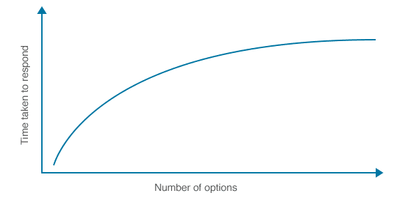
Source: Hick’s Law
Experiential flow is much more important than the sheer number of available actions. Too many interface objects actually impede decision-making (and therefore goal accomplishment).
Consider, for example, the difference between one gigantic signup form and a multi-page series of smaller forms with the same information. The one long form will take less time, but the series of smaller forms will seem more manageable and less complicated to the user.
In the below example from LinkedIn, combining a wizard form with a progress bar is a great tactic for improving the pace of the experience. The long process of creating a professional profile is divided into 4 manageable steps. Users can also see how far they’ve progressed, which incentivizes them to proceed further. Pacing is less about efficiency, and more about what the user is comfortable with (UX) — not overburdening them, but not slowing them down either.

2. Responsiveness
A product’s reaction time relates directly to the level of user control. The 3 most important response time ranges for digital products are:
- 1 second – Direct Control — The user feels they are directly manipulating the system, as they would a physical tool. No feedback is necessary except the visual manifestation of their results.
- 1 second – Indirect Control — The user notices the delay, but still feels in control over the site experience. For example, this delay is acceptable for loading new pages.
- 10 seconds – Little Control — The user loses their attention and their workflow is interrupted. Feedback is crucial to minimizing abandonment, which is why load screens are so popular.
Delays in response time must match the magnitude of the task. For instance, 5 seconds is acceptable for loading a cloud-based dashboard, but it’s unacceptable for triggering a dropdown menu. The longer the delay, the more the relationship between the user and the interface dissolves.
Source: UXPin
3. Context
How, when, where, and even why an application is used all affect the perception of time.
For example, the average website visit lasts 2-4 minutes, while the avarage ecommerce sale lasts 28 minutes. Likewise, someone comparing prices on their mobile device while at the mall values speed more than someone doing the same thing at home on their couch.
If you find that users are leaving your site prematurely, you may want to revise your link copy. You can also check the visual hierarchy (colors, contrast, typography) of the page to ensure important information is emphasized.
However, these attention-grabbing methods can be counter-intuitive on a site where you want your user immersed in a single page of content, such as a blog. In that case, you’d probably want to make better use of white space to emphasize the content (similar to Medium). The same strategy for capturing attention has two different effects depending on the type of site — it all depends on context.
Takeaway
When it comes to interaction design, even a delay of one second can mean the difference between success or failure. If the user experience is too slow, then people become frustrated. If the user experience is too fast, people might miss vital information (or not know what it means). Understand the human perception of time, the limits of speed (and carousels), and the importance of directness in clicking.
When in doubt, remember this simple usability principle: clear is smooth, and smooth is fast.