
Everyone is talking about responsive design these days nd , and everyone certainly has a strong opinion about it. But, whether you love it or hate it, responsive design is bound to go mainstream. Every business from Harvard to AOL are embracing responsive design as the wave of the future, and more websites are popping up on every device with an internet connection with conforming layouts.
Take a look at these new, smart and stylish responsive layouts and get inspiration for your next website. Spanning across different kinds of companies, strategies and aesthetics, all of these websites have one thing in common: great responsive design.
1. BBC

The world’s biggest news outlet hopped on the Internet’s biggest design trend in the summer, and the designers were thrilled about finally reaching a universal design layout across all platforms. The design’s minimalist look provides a blank canvas for the news outlet to show off beautiful photos — even on a mobile device.
2. Disney

The magic-making family entertainment giant tasked a mammoth responsive design project on a (comparatively) tiny group of 30 developers, and brought it to fruition in October. The design succeeds by preventing major scaling of the content within the website, meaning that big videos and interactive elements don’t lose their size across platforms.
3. Zurb
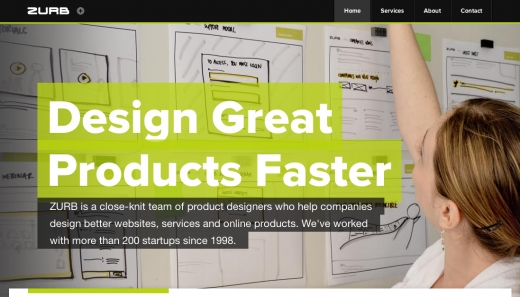
Some of the companies that show off the best responsive design layouts are also in the business of creating them. That’s the case with Silicon Valley-based web design firm Zurb. The overall layout solves the common problem of too much white space by cleverly switching graphical elements from desktop to mobile. The result is a full and vibrant look that always sizes perfectly.
A Book Apart
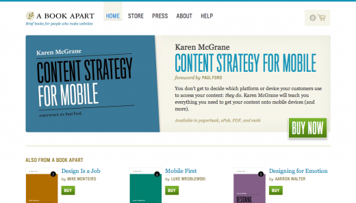
When a company writes the book on responsive design, it’s a no-brainer that theirs will be amazing. A Book Apart, the educational retail arm of popular web design blog A List Part, is easily one of the best examples of an ecommerce website that takes full advantage of responsive design. This is because the layout manages to maintain an orderly product display system that intelligently conforms to devices without remaining cluttered. Add to it the company’s flawless aesthetic eye and branding, and it’s a (fitting) master class in design.
Harvard University
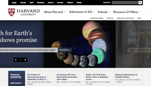
Clean and classic Harvard University embraced responsive design without losing decades of online brand-building by incorporating the university’s longstanding aesthetic (Harvard crimson, anyone?). The result is a forward-thinking layout that doesn’t read too modern. This website is the perfect example of the difference between layout and design.